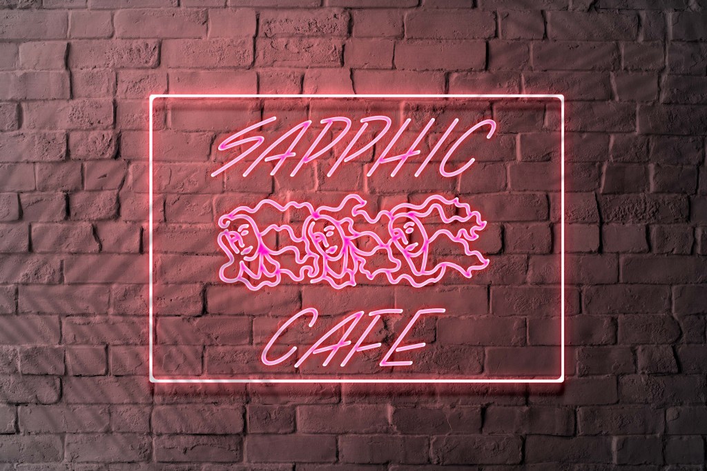
Sapphic Café in Southhampton
Development of a new, illustrative logo design for a British LGBTQ+ organisation. The design is based on research about the Sapphic violet.
Project type
Corporate Identity
semester
WS 2021/22
Supervisors
Prof. Dr. Thomas Mayfried,
Dr. Michele Galuzzo
Category
Logo, Branding
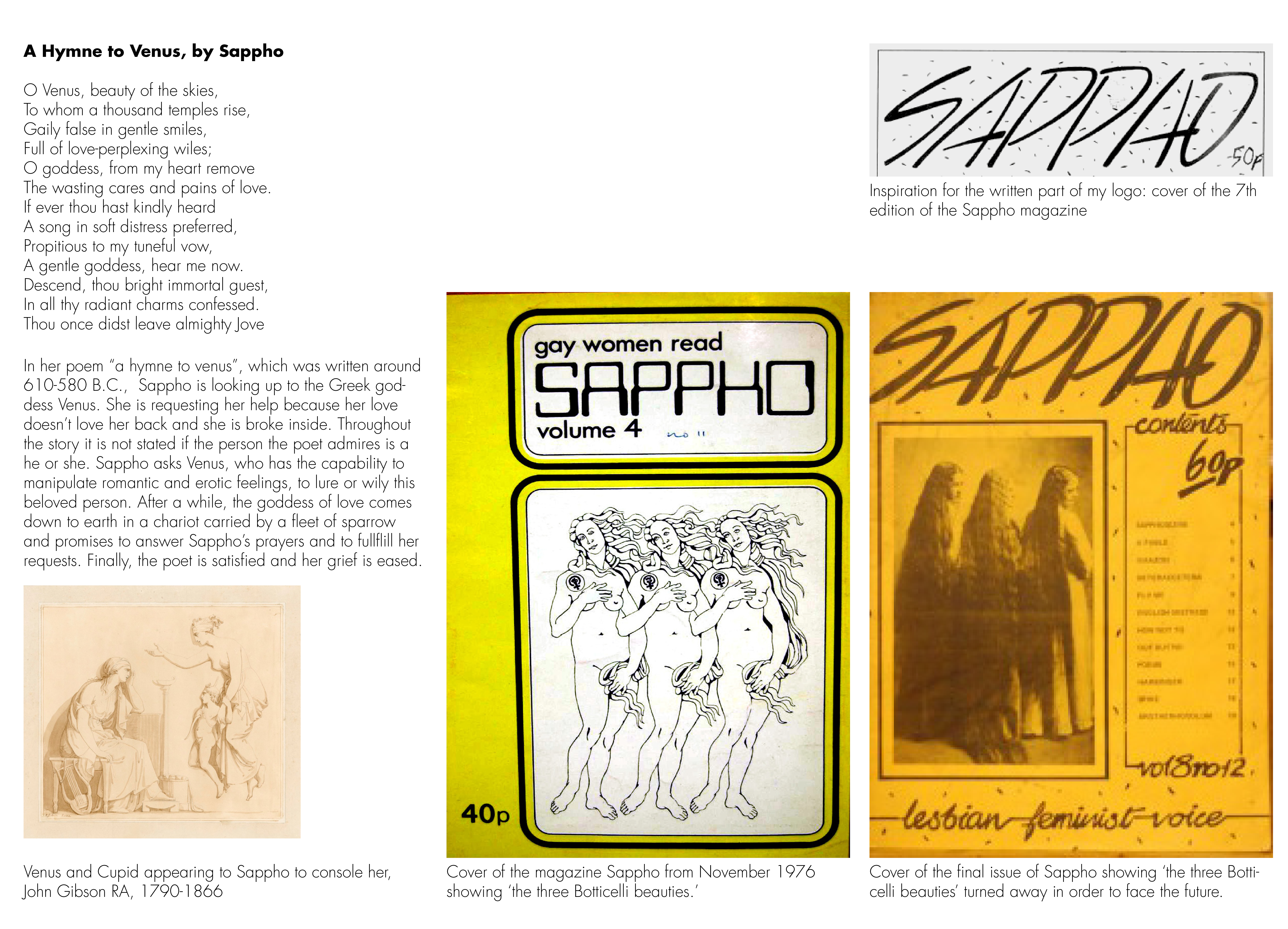
Based on Research about the Famous Sappho Magazine
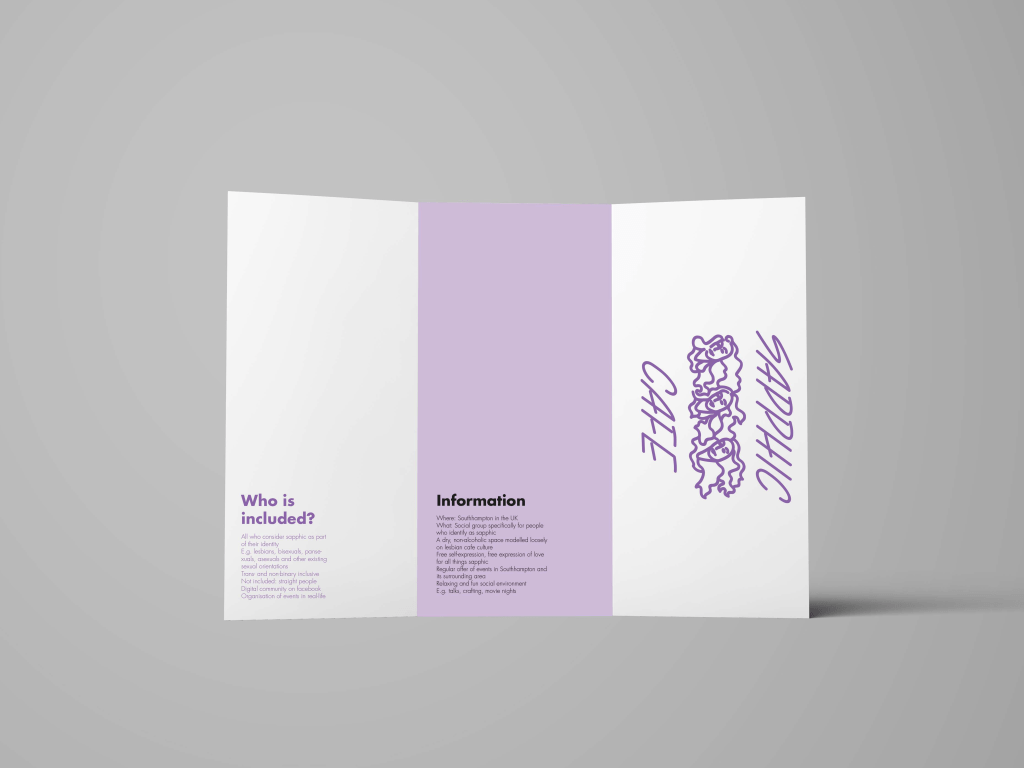
In the second module of the Identity project during the winter semester of 2021/22, we conducted extensive research on gender identity. We also studied various sexual orientations. This research was supervised by Michele Galuzzo. My research focused on the symbol of the Sapphic Violet. I studied its impact on the development and success of the renowned Sappho magazine. Based on this research, I designed a new logo for the British LGBTQ+ organization Sapphic Cafe. Additionally, I created a headline and cover design inspired by the first three issues of Sappho magazine. The first three issues featured a new lesbian interpretation of Botticelli’s famous Venus.
Sapphic Violet
What is the meaning behind this symbol?
In which historical contexts was it used?
Find out more and dive into my research!
Logo Development
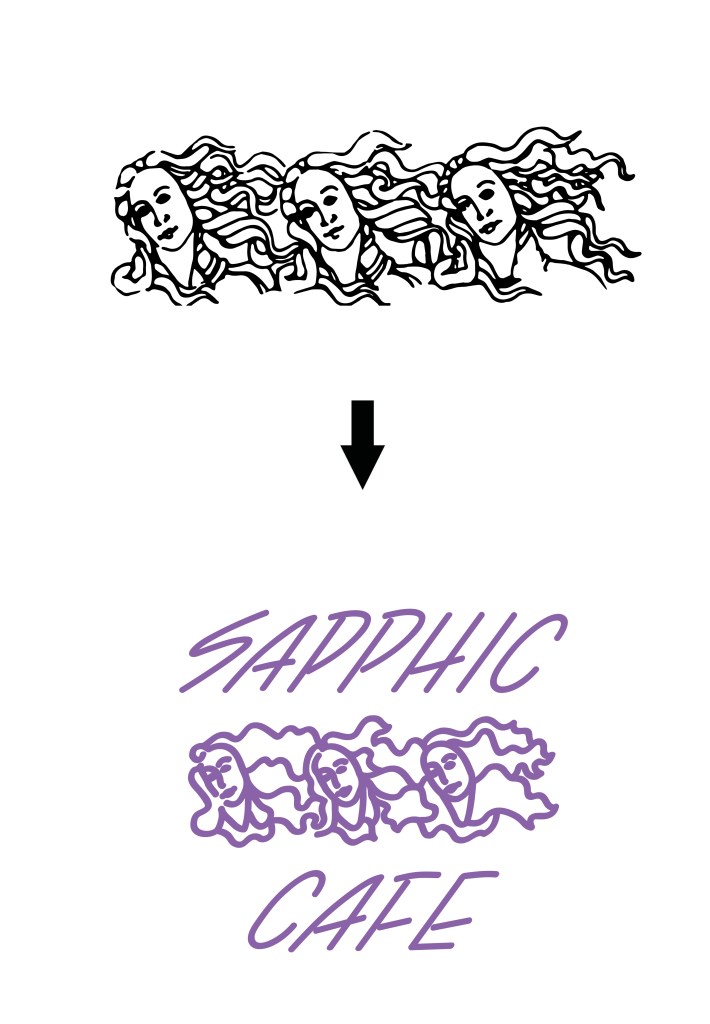
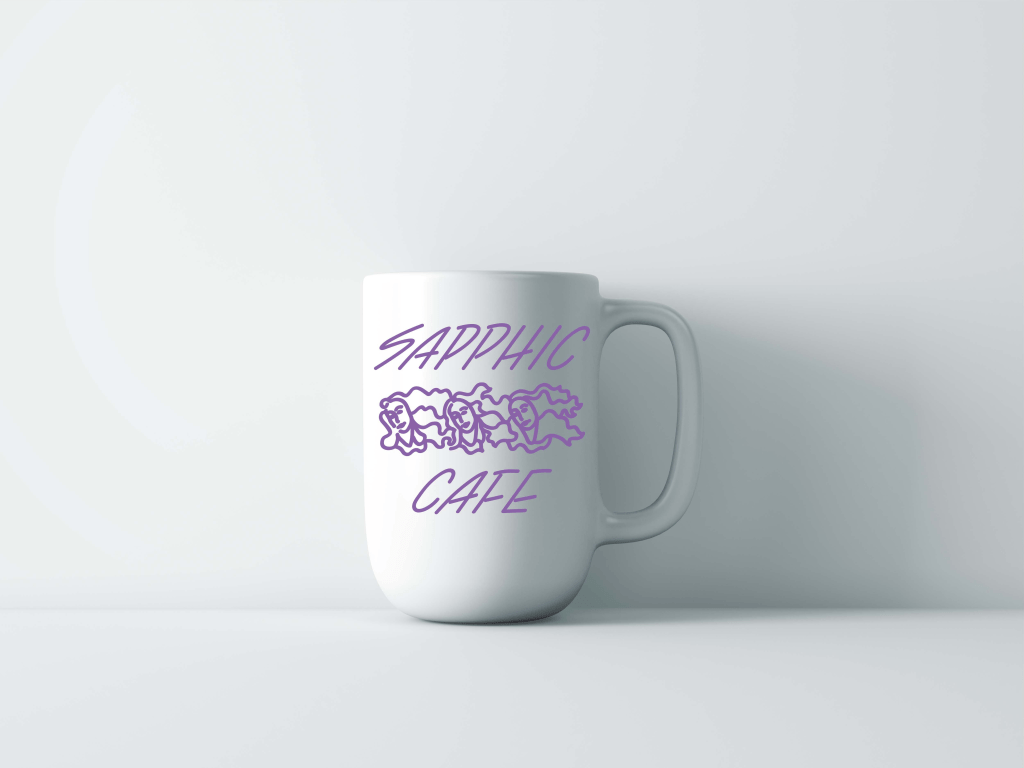
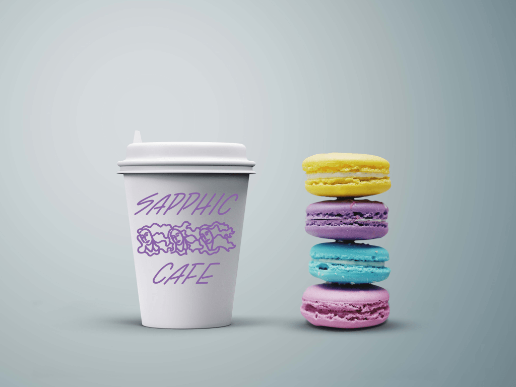
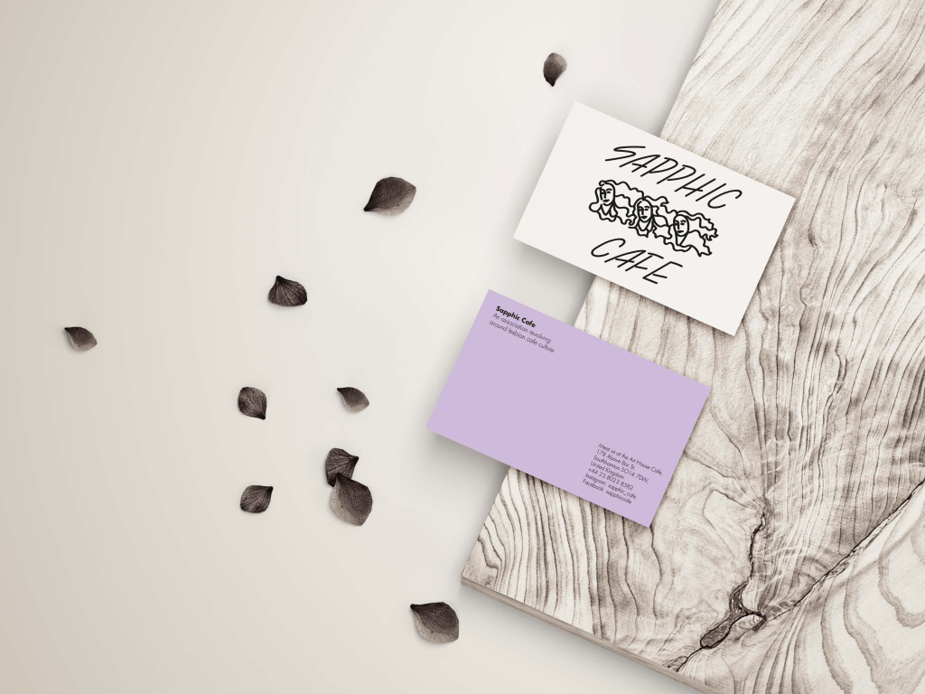
The final logo was based on the heads of the three venuses on the cover of Sappho magazine. The general shape was redrawn with a thicker stroke to simplify the logo and give it a new character. Still, the final result remains quite illustrative.
Logo Applications
Historical References from the Sappho Magazine